Pastel Editing Tips for Your Photos
When editing an image, I don’t like to push things too far. I’m sure a few people just did a little laugh snort because I do use a lot of colour in my images but I always edit, then look back at the original and ensure they’re not too far apart in natural tone. The look of soft pastels instead of harsh hues is what I aim for.
You want your final result to believable and beautiful, not a saturated assault on the senses.
Learning to control the colours within your image, how the colour palette works together and how to integrate gentle adjustments throughout the image is what creates the magic.
To create pastel tones, the effect will not only depend on how you edit but also how you captured your image originally. If you know you’ll be wanting to produce pastel colours, always capture your image a little brighter than normal by overexposing slightly but ensuring you’re not losing detail within the highlights. Having lighter tones to work with from the start will help you massively and avoid the need to remove harsh shadows and dark spots.
*If your original image is too dark, you may struggle to bring the level of brightness required to produce a whimsical pastel toned image. When increasing brightness in post processing, it can result in noise (visible spots) within your file so always aim to capture the scene with balanced shadows and highlights and with a low ISO which helps to reduce overall noise. Take a peek here at my suggested settings for various scenes.
When using a preset in Lightroom for example, you will no doubt need to adjust the temperature, tint or exposure to suit your image as there’s no way for the preset creator to know how your image will be exposed. Gentle presets and filters will provide a blanket edit but even still, if you want a more professional result, it’s best to make some tiny adjustments yourself to your image to get it looking swanky.
Pastel Editing Tip:
Just before we get started, there’s one thing I want to quickly mention. If you’re altering any part of the image, always make sure the other areas of your photo pair together nicely. As an example, you might want to create some pastel colours in the sky portion of your image, ALWAYS be sure to check that there’s at least a hint of the same tone in the foreground or other areas so the tone is consistent throughout. It’s a total giveaway if your sky is all pink and beautiful but the lake in your foreground is dark and gloomy and reflecting dark blue sky.
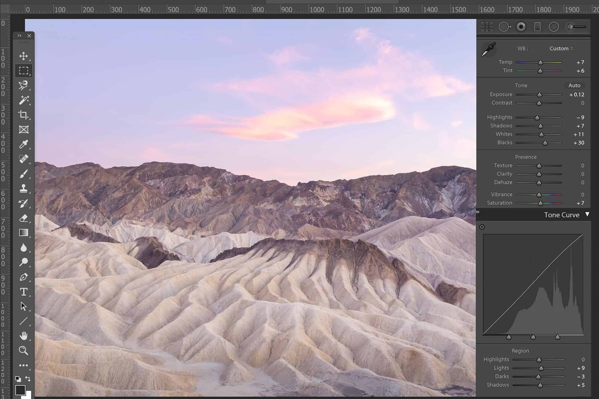
Quick Pastel Tips for Lightroom
Import the file you wish to work with then open the ‘Develop‘ screen.
This is where the goodies are found to make quick and easy adjustments to your photographs tone, temperature, shadows/highlights, brightness/darkness, contrast and so much more.
For overall image adjustments, you can simply adjust the toggles to produce an image with your desired tones. If you’re wanting to only adjust the sky or foreground for example, you’ll need to use either the Graduated or Radial Filter or Adjustment Brush. I personally find the adjustment brush easiest to use but it’s worth practicing to check which fits you best.
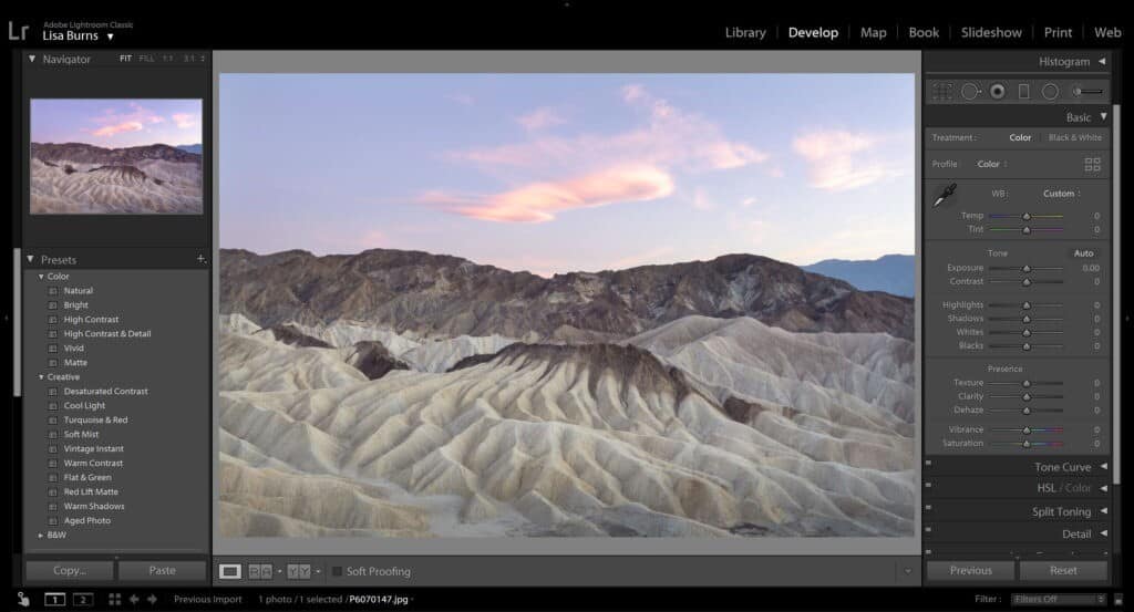
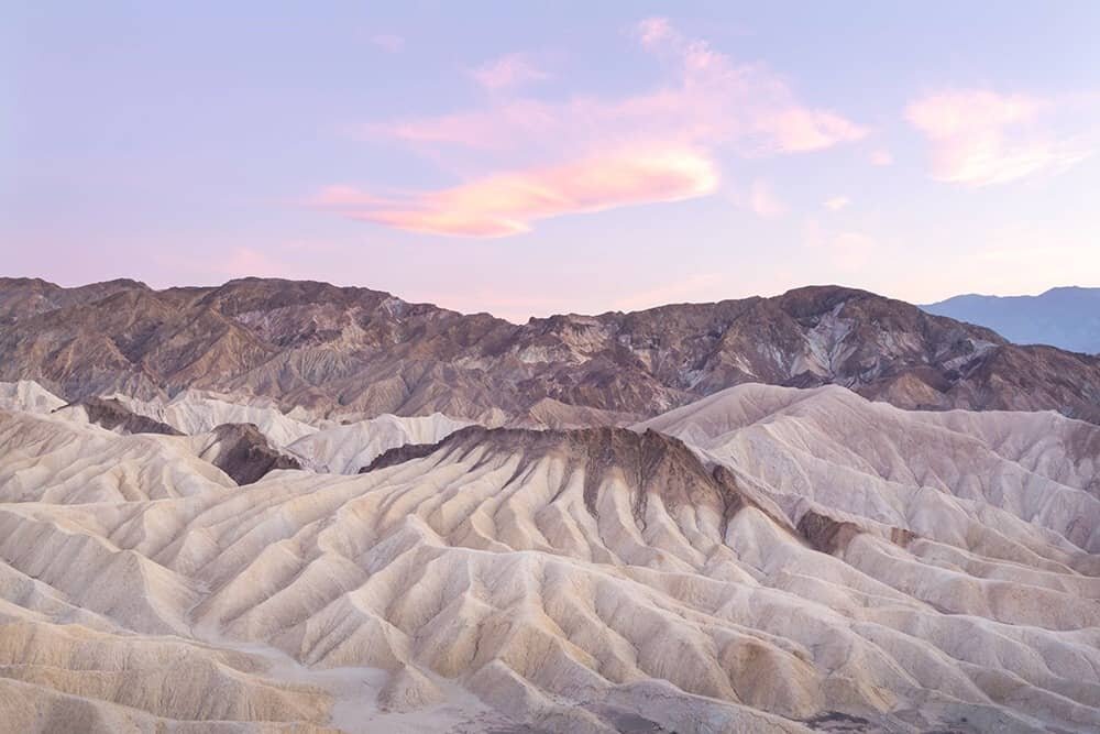
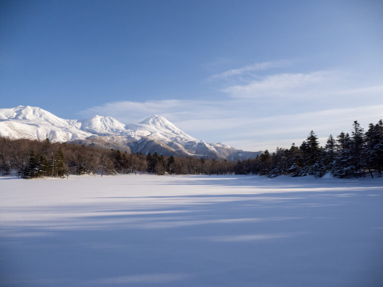
THE BEFORE
What to do when you open your file
- Slightly increase the Temperature (Temp) and Tint toggles found at the top of the ‘Develop’ screen. For pastels, you’ll want a little bit of warmth and some pinky goodness. If you’re opting for a cooler pastel, try decreasing the Temp and increasing the Tint, remember slight adjustments to test the results.
- For pastels I always find the brighter the better (not overexposed, just nice and bright). Gently increase the shadows and blacks of your image on the toggles, then if needed, very slightly increase the exposure too. You’ll very quickly see if using exposure is required or not as it’s a less is more tool!
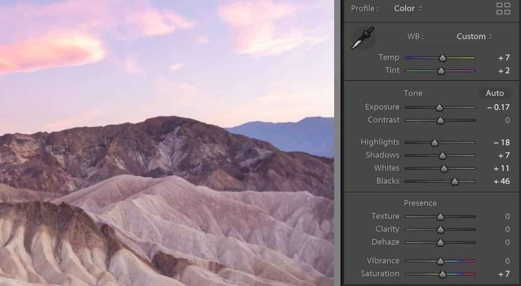
- You can try increasing the saturation every so little also, but watch as you do this to avoid any patches of blobby colour. With pastels I never really find the need for added saturation but again it depends how your original image was captured.
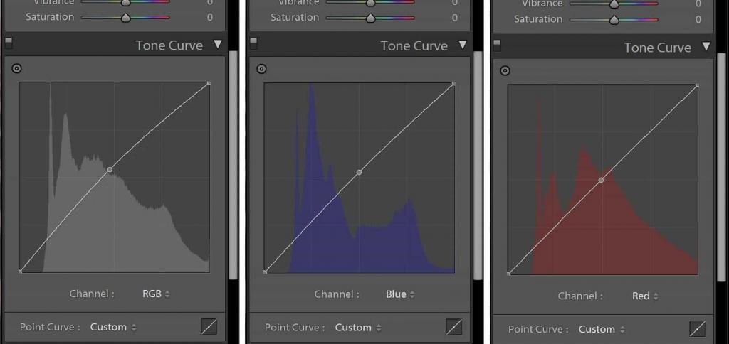
- Use the Tone Curve to access the RGB Channels and adjust the Red, Green and Blue channels separately. This is my favourite part of the pastel process! I prefer to use Curves in Photoshop but if you’re more comfortable on Lightroom then this is the place to work your magic. When adjusting the tone curve, always pull from the very center up toward the top left corner in a diagonal direction, I find this generates the most natural results.
- You can venture into the world of Split-Toning too which can produce some great pastel tones in the Highlights and Shadows. I tend to find this is a bit hit and miss but I’m sure with a lot of patience there are ways to make it work for you.
- At the end of editing, I always add a tiny touch of exposure for a final pop of brightness and make sure I go back and look at the original image to ensure I didn’t go too far. The first few times you’re attempting pastel edits try not to get frustrated by too much pink or purple appearing, it’s a really fine line and very small adjustments that produce the best results.
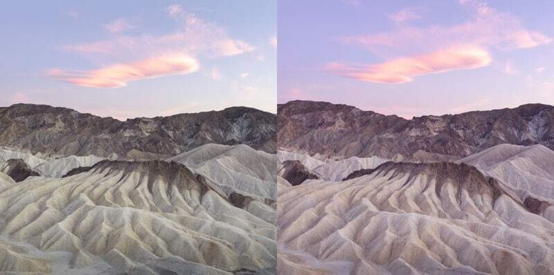
Before vs After
Quick Tips for Photoshop
After the results in my recent Instagram poll about who uses Lightroom vs Photoshop, I was totally floored to find the majority of my followers and readers used Lightroom. It kind of blew my mind! But, I understand that Photoshop can seem really daunting at first and even though I have worked with it since 2006 (CS2), I’m pretty sure I’m only still taking advantage of about 5% of it’s abilities.
I used Lightroom for years when I was photographing weddings and portraits because the ability to create your own presets and export a cohesive collection of work in one giant batch is such a great time saver. Even then though, I still used Photoshop when I needed to make small adjustments within an image because I was a total perfectionist, I’d fret if there was a small spec of something in 1 out of 1000 images that I’d missed. I found things like fixing blemishes on faces, removing unwanted objects within the frame or gently editing tones in certain areas was far more precise in Photoshop.
That said though, maybe I never gave Lightroom much of a chance because the shortcuts I’d created in Photoshop just became a habit I couldn’t break.
Anyway, I wanted to share how I create pastels with Photoshop just as a way of offering an alternative for those interested in trying it out. If you are keen, you can do a free trial of Adobe Photoshop here for 7 days, then it’s $14.29 monthly to opt for the ‘Photography Plan’ which includes both Lightroom and Photoshop (works out cheaper to get both than just one!), something if you’re working in photography I believe is an essential part of your business. The plan also comes with step-by-step tutorials that are no doubt way more technical than my tips 🙂
You can take a peek at my three favourite editing tools on Photoshop if you really want to explore the possibilities.
How to Create Pastels in Photoshop
Firstly, some shortcuts to use via your keyboard. These are typically the default settings so they don’t require any fancy steps to use, although if you do want to change the allocated keys, simply go to ‘Edit > Keyboard Shortcuts’.
Ctrl + L = Brightness/Contrast
Ctrl + M = Curves Tool (my M button is very overused and faded!)
Ctrl + U = Saturation/Vibrance
Ctrl + D = Deselect
Ctrl + S = Save
Ctrl + (- or + keys) = zoom/zoom out
Step One – Once you’ve opened your image in Photoshop, I like to start by brightening it up a little. Click Ctrl + L then adjust slightly.
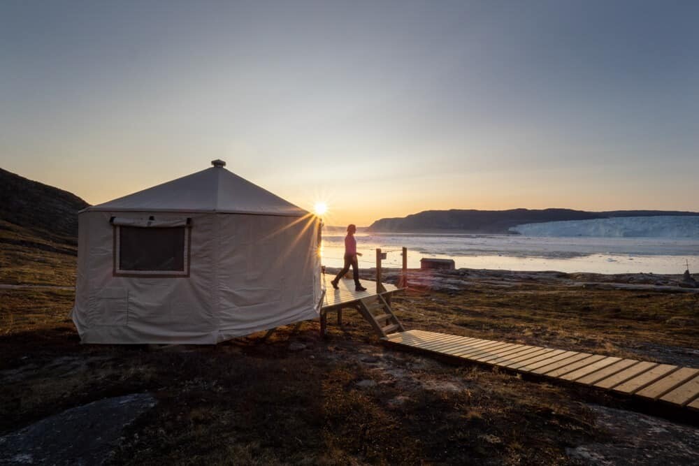
Step Two – If you’ve already got a sunset/dusk shot like the example I’m using, there will already be some beautiful pink, pale blue and purple tones visible in your photo. To enhance them, simply use the select or Rectangular Marquee Tool to tell Photoshop what area you would like to play with and then adjust using the curve tool. Alternatively, you can adjust the tone of the entire image without using the select tool and skipping straight to Curves by pressing ‘Ctrl + M’.
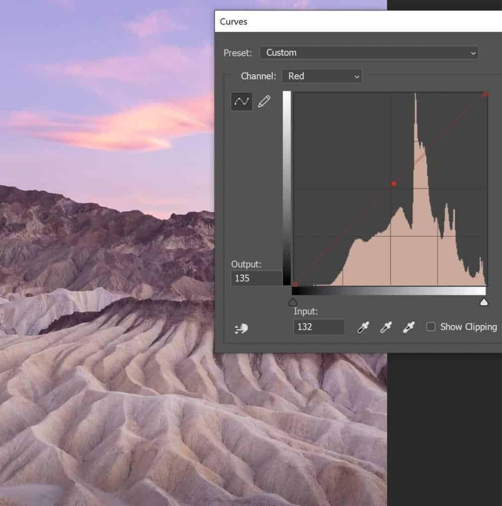
Step Three – I primarily work with the ‘Curves’ tool when creating pastels, my favourite function in the program and the one I use about 90% of the time. Type ‘Ctrl+M’ to open the Curves box which is where the fun begins.
Here you’ve got the option to play around with the colour tones, creating your own pastels using a combination of red, green or blue hues (RGB) just like the Tone Curve in Lightroom but less reactive and touchy (in my opinion). In the centre of the box you’ll see a drop-down panel with ‘RGB’, click this and you’ll see the options of the three colours appear. For pastels I prefer to adjust the red and blue tones most.
You can also use the main RGB channel to gently pull up the tone curve and adjust the overall brightness of your image.
Step Four – Slowly increase the red hues by clicking on the very center of the graph and gently pulling up the center of the line in a NW direction, toward the top left corner of the square. You’ll quickly see that again, less is more, much more. It’s very easy to add dramatic effects so a gentle increase should do the trick nicely. To test it, go all out and pull the line around and see what bonkers results it can produce, then of course be more restrained than that if you want a pastel look.
Step Five – Find your happy medium! As you progress it may be necessary to adjust the brightness to create a softer overall effect. It’s normal to not get the exact result you want with one tiny adjustment of the curve tool so spend some time and see what you can make happen. Once you get more comfortable with it, you’ll be editing pastel photos in less than a minute!
Tip: To work on sections within your image rather than the entire frame, click and drag your mouse to select an area using the Rectangular Marquee Tool (second from the top on the tool belt). Hold down the ‘Shift’ key while doing this to select smaller sections and join/blend them all together. Really handy for smaller sections where you need to select little bits at a time.
As I mentioned at the start, these are just quick tips to get you started in producing beautiful pastel tones within your images. I’d strongly advise to spend some time working with the tools available in both Lightroom and Photoshop to see what works best for you.
You’ll be surprised at the magic you can create and just a little bit of patience and practice pays off.
If you’re sharing pastel beauties on Instagram, I’d love if you can tag them using #thewanderinglens so I can have a peek!
Hello! I’m the founder and photographer behind The Wandering Lens.
With 19+yrs experience as a professional travel and landscape photographer, all advice found on this site is from my personal experience, or that of contributors, on the road. I hope it’s useful for your own travels and would love to hear in the comments about your trips and experiences around the world.
Blog Comments
roisin armstrong
September 17, 2020 at 4:57 am
Great article, some really helpful tips and I love that you’ve given lots of examples as well. Thanks for sharing.